Integrated art lesson, 6th grade. Basics of color science. Abstract with presentation
Lesson in 6th grade on “Fine Arts” on the topic “Fundamentals of Color Science”
(integrated lesson together with a psychologist) for the textbook “Fine Arts.
Art in human life" by L.A. Nemenskoy Developed by: Leshcheva Irina Anatolyevna, art teacher, highest qualification category, MBOU "Lyceum No. 48 of Kaluga" Purpose: to introduce students to the basics of color science. Objectives: - introduce the basic characteristics of color: color wheel; primary and composite colors; chromatic and achromatic, cold and warm colors; color saturation; lightness; - teach the ability to find harmonious color combinations; - cultivate artistic taste; - develop creative imagination; - ability to work in pairs; — introduce students to the influence of color on the human psyche. Materials: gouache, brushes, stencils with drawings. Visual range: presentation “Color. Fundamentals of color science".
During the classes
1. Organizational moment.
Motivation for learning activities. 2. Updating knowledge. 3. Statement of the educational task. 4. Discovery of new knowledge. 5. Primary consolidation. 6. Independent creative work. 7. Physical education minute. 8. Inclusion in the knowledge system. Psychology and color. 9. Reflection (result). 1. Greeting students. Motivation:
today for successful work in the lesson we will need: gouache, brushes, stencils with ready-made drawings (lay out on the tables in advance).
— Check if everything is ready for the lesson? (student activities - conduct a self-assessment of readiness for the lesson). - I wish you good luck in this lesson in your creativity! — Today I want to start the lesson by reading V.G. Abramov’s poem “Tell, tell, artist”: (presentation: slide No. 3)
Tell, tell, artist, What color is the rain?
What color is the cloud in the blue sky? What color is the song? What color is the wind? What color is joy? Tell me, what colors are Winter, Spring and Summer?... - What do you think will be discussed in class today? (children's answers: about color). — You are right about color, its secrets, its characteristics and the role color plays in people’s lives (students are immersed in an atmosphere of friendliness, tuned in to conscious activity in the lesson), (presentation: slide No. 4). 2. – What do you think color is? (answering questions, expressing your opinions), (presentation: slide No. 5).
Color is one of the most important visual means in art.
Color is a child of light. - Tell me, guys, do we see colors in the dark? How is color formed? (children's answers: no). Only when rays of sunlight or electric light - light waves - enter our eyes do we have the sensation of color. Light travels in waves that are reflected or absorbed by the surface of objects. Color appears only when these waves are perceived by the human eye (presentation: slide No. 6-8 - Newton’s breakthrough,
brief information about how in the 17th century the great scientist obtained color decomposition using an experiment with a prism).
The study of color is carried out by such a science as color science (presentation: slide No. 9).
- How many colors do you know?
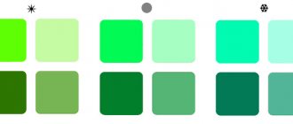
Try to list them (students name the colors). 3. — Any simple creativity kit usually contains 6 paints. Tell me, is it possible to paint a picture using only these colors? (children's answers: you can, you will have to mix the paints for this). In nature there are many colors and shades (200 color tones and shades, which have names). And so that people would not get confused in such diversity, people came up with a classification of colors and the science of color science. — Where can knowledge about color be useful to you? (children's answers, express their opinions). — What goal do you set for yourself in this lesson, studying this topic? (students formulate the goal of the activity). 4. – Artists divide all colors into achromatic and chromatic (presentation: slide No. 10):
chromatic are colors that contain color (red, yellow, green, orange, etc.), achromatic are those that do not contain color, this is white, black and all shades of gray that are obtained by mixing white and black paint.
In this group, the colors differ only in lightness and tone. Colors that cannot be obtained by mixing other colors are called primary: red, blue, yellow (presentation: slide No. 11)
.
The colors that can be obtained by mixing primary paints are called composite (presentation: slide No. 11).
For simplicity and convenience, a color wheel was invented
(presentation: slide No. 12-15
).
It shows how colors are related to each other and allows you to determine a harmonious combination of colors. Black and white are not marked, because are not a color. By drawing a diameter in the color wheel (a line through the middle of the yellow color), you can determine that the opposite end of the diameter will pass through purple; opposite orange will be blue. Such colors are called complementary. This is when one color is the background, and the other is simply an accent on it. Color wheel usually divided into two parts: warm and cold (presentation: slide No. 16)
: warm - red, yellow, orange - reminiscent of the color of the sun, fire, which in nature give warmth; cold - blue, light blue, green, blue-violet, blue -green, which can be obtained by mixing with the named colors - they are associated with cold, ice, snow, water, moonlight. Interestingly, warm colors are best combined with black, cold colors with white. Characteristics of color
(presentation: slide No. 17)
In addition to this classification, color has the following characteristics: hue - associated with the color of familiar objects; saturation - represents the difference between the chromatic color and gray color of equal lightness;
lightness - the quality inherent in chromatic and achromatic colors, depending on the addition of white; darkness - changes depending on the addition of black to the color. — Guys, why do you think you need knowledge of color characteristics and color construction systems? (children's answers: for successful work as an artist, interior or clothing designer). 5. — We got acquainted with the main characteristics of color, its meaning in art and life. Now try to create a color wheel, having a ready-made stencil (print the stencil in advance, lie on the table). Take a stencil and use paint to show sectors with primary colors. - What colors are these? (children's answers: red, blue, yellow). Now show the sectors with composite colors. How to get them? (children's answers: mixing paints). 6. Independent creative work in pairs with self-test according to the standard:
- paint the top sector yellow, add a little red to it.
- What color did you get? (students mix paints and get orange); - add a little blue to yellow, we get it? (green); — paint the remaining sector blue and add a little red. What color did you receive? (violet). In this way, different shades of color can be achieved by adding more or less of another primary color to a base color. 7. Physical education minute. Prepare cards from colored cardboard with cold and warm shades of colors. Show cards with different shades in turn, explaining what children should do: warm - students raise both arms up, straighten their hands, stretch their heads up; cold - press your hands to your body, round your shoulders; black - lower your hands, frown; white - put your hands on the table and smile. 8. – You have all seen one of the miracles of nature - the appearance of a seven-color rainbow after rain. It owes its appearance to water droplets in the air: a white ray of sunlight, refracting through them, forms the so-called solar spectrum, in which we distinguish red, orange, yellow, green, blue, indigo and violet rays. In order to remember the colors of the rainbow, people came up with a saying where each letter in the word means a color. Let's remember it: (every hunter wants to know where the pheasant sits) (presentation: slide No. 18)
.
— What color in the rainbow cannot be obtained by mixing primary colors? Why? (student answers: blue, you need white to get it). There are no white and black colors in the rainbow, but they exist in nature. When mixed with other colors they change their color. By adding white to any color, we get lighter shades, adding black - more saturated shades. You can also convey mood through color. Warm colors give joy and optimism; cold colors give sadness, melancholy, and thoughtfulness. Painting is the art of color and light relationships. When working with paints, this should be taken into account. Having found the right color scheme in a painting or drawing, you can see the beauty of the surrounding world and the work itself (presentation: slides No. 19-22). Psychologist's block (presentation: slides No. 24-26, 27-28).
Our mood and emotional state are influenced by many factors - events, words, tone of voice of the interlocutor, smells, colors and much more.
Some of this is fleeting, transitory, but, for example, colors have a deeper influence on our psycho-emotional state and are constantly present in our lives. Imagine what your mood would be like if you only saw shades of gray every day? Or, on the contrary, bright and flashy colors without the possibility of rest for the eyes? Experts have long noticed the effect of color on our mood, and the concept of color therapy appeared. In official psychology, the concept of color therapy is absent, because research in this area is very vague and differs in different countries and cultures. For example, in our country the color white is associated with marriage, but in India people dress in white for funerals, so the perception of the color will be slightly different. In addition, there is fashion and mass media that dictate current colors and create new associative connections. But of course, there are some concepts about colors that are close to all people. For example, the association of red with energy, aggression, passion. It is on this general perception that color therapy is built, which can calm a person or energize him. There are several ways to use colors to calm your nerves and improve your emotional state. These are the Luscher test, chromotherapy and the use of colors in interiors and clothing. In the mid-twentieth century, Swiss psychologist Max Luscher invented a color test, which is still used to determine a person’s psycho-emotional state. Its essence is to choose colors that you currently like or not. And based on the results of your choice, the specialist determines your condition. The results are most often amazingly accurate, since the choice of color is subconscious (the test taker is asked not to become attached to fashion and favorite colors, but to be guided by momentary sensations). As a result, a person reveals his true essence and emotions, which he may not even be aware of in everyday life. There is evidence that color healing was used in ancient Egypt, China and India. For this purpose, multi-colored crystals, water colored by the juices of various plants, and devices for refracting and coloring sunlight in rooms were taken. Nowadays, chromotherapy is actively used. These are special rooms in which a person lies or sits in a comfortable position, relaxing music is played, sometimes suitable aromas are used and the color of the room changes (sometimes glasses are used). Color therapy experts say that the color perceived by the eye triggers a chain of reactions in the brain, followed by one or another result - relaxation, vigor and even suppression of appetite, if required. Colors are selected individually for the person after consultation. The colors we use in interiors, clothing or accessories affect us constantly. Knowing this, you can influence your condition and how others perceive us. White color is associated with ideality, completeness, purity. Black is the color of strength, elegance, perspective and depth, but at the same time of evil and mysticism. Gray is a compromise between black and white, a neutral color that is basic without being distracting. Accessories of bright colors “work perfectly” against its background. Brown color is natural and natural and is associated with stability, reliability, and comfort. Yellow and orange whet the appetite, set the mood for communication and fun. In excess, these colors irritate the eye receptors. Red color is passion, energy, aggression, action, movement towards a goal. Color has a strong enough effect on the psyche, so it can be used in small quantities. For example, paint one wall in the room or use red accessories in the interior. By the way, red plates suppress your appetite. Pink is one of the most controversial colors. From a psychological point of view, this color is associated with love and care. Green and blue help you relax and unwind. This is explained by the fact that when looking at these colors, the eyes do not tense, the muscles relax. These colors help you recover from stress. The color purple stimulates creativity and helps you focus on work. His clothing suggests wisdom and authority. Lilac creates an atmosphere of calm, relieves tension and anxiety.
— Today you learned the different characteristics of color. Using these characteristics and knowledge of the psychology of the influence of color on a person, I suggest you complete another creative task. In front of you is a stencil with the image of a house and a doll. Using different colors and shades, try to choose the right color scheme for the picture so that it turns out beautiful and pleasant for you to perceive (independent creative work, ask boys to paint a house, girls a doll). 9. – What tasks did you set in the lesson? Have you achieved them? — What concepts did you become familiar with today? — Will this knowledge be useful to you in the future? — What is more interesting: using ready-made paints or finding the desired color yourself? (student responses) Exhibition of works and evaluation. Thanks everyone! The lesson is over. Presentation on the topic: Color. Basics of color science
Presentation on the topic: Psychology of color
We recommend watching:
Summary of an art lesson for 6th grade “Still life in graphics” Art lesson in 6th grade. Grow a dream Synopsis of an integrated lesson in 6th grade (literature, fine arts) Synopsis of an integrated lesson in fine arts, literature and MHC for 6th grade
Similar articles:
Application. Portrait of a man
Lesson summary on fine arts in grades 5 - 6
Lesson summary Color. Basics of color science. (6th grade)
Municipal budgetary educational institution
Teplostan Basic School
Lesson plan for a lesson in fine arts in 6th grade
Lesson topic: “Color. Fundamentals of color science"
Completed by: Shmakalova L.N. (art teacher)
Target:
introduce students to the basics of color science.
Tasks:
1. give the concepts of the color wheel, primary, composite colors, complementary colors.
2. cold and warm colors; lightness, color contrast, color saturation.
3. teach how to obtain new colors by mixing paints.
4. cultivate artistic taste.
5. develop creative imagination.
Equipment:
interactive equipment (projector, interactive whiteboard), presentation, visual material - pictures, pictures on disk, album sheets, paints, pencils, eraser.
Vocabulary:
primary colors, composite colors, complementary color, cold and warm colors, color contrast, lightness, color saturation.
Lesson Plan
1. Organizational moment.
2. Introduction to the topic, analysis of the visual aid.
3. Practical part.
4. Summing up, discussion of work.
5. Homework.
During the classes:
- Organizing time.
Greetings. Checking students' readiness for the lesson (art supplies), announcing the topic and purpose of the lesson
- Introduction to the topic, analysis of the visual aid.
What is color, what is its nature? What is the coloring of objects? Why are some objects blue, others red, and others green? It turns out that the reason for everything is the sun, or rather, its light rays that illuminate everything in its path.
In the dark we don't see any colors. When rays of sunlight or electric light - light waves - enter the eye, we have a sensation of color.
Color
is
one of the most expressive means in art. It greatly influences the feelings, condition, and mood of people. Human perception of color developed naturally, in the conditions of the surrounding nature, and despite all individual characteristics, there are scientifically based general patterns of color perception. For example, red is a symbol of the Sun, fire, blood, life. It is usually associated with joy, beauty, goodness, warmth; but it also means anxiety, danger, anxiety for life. White color most often symbolizes freshness, purity, youth; but it can mean peace, lifelessness and even mourning among some peoples. Black color from the point of view of physics is emptiness, the absence of light and color; its traditional meaning is everything “night”, unkind, hostile to man, grief and death.
1. Information about color science.
— Flower science
- the science of color - studies many issues that an artist dealing with paints should be familiar with.
2. Properties of color.
— The colors of the objects we see are determined by their ability to reflect only some part of the “white” light falling on them, that is, some part of the spectrum, and absorb another part of it. This phenomenon is called selective absorption. For example, a green body reflects only the green part of the spectrum and absorbs the rest of the rays. If we look at this body through red glass, it will seem black to us, since the red glass, in turn, absorbed the green rays reflected by the body (and the rest were absorbed by the body itself).
All spectral colors plus purples missing from the solar spectrum (intermediate between the extreme reds and violet) make up the so-called chromatic
(“color”)
color scale.
White objects reflect the entire spectrum, while black objects, on the contrary, absorb the entire spectrum.
If you take white and black paints and mix them in different proportions, you get a large range of gray tones, from pure white to black. This will be a different color scale - achromatic
(“colorless”).
3. Basic concepts in color science.
— Achromatic colors
differ from each other only in one feature -
in lightness
(light gray or dark gray).
Chromatic colors
, in addition to differences in lightness, are characterized by two more main characteristics - hue and saturation.
Chromatic colors are conventionally divided into warm
and cold .
Warm colors include the yellow-red part of the spectrum, and cold ones include the blue-blue part of the spectrum. These groups of colors received their names of warm and cold: some - by association with the color of the sun and fire, others - by association with the color of the sky, water and ice. Violet and green colors occupy an intermediate position and in various specific cases, depending on the combination, can be classified either as warm or cold.
Look at the color wheel in the picture below. For any chromatic color, you can choose another color that, when mixed with the first, will give an achromatic color (almost close to black). Such pairs of colors are called complementary.
So, to raspberry-red there will be green-blue, to yellow-green - purple-violet, etc. Almost pairs of such complementary colors in the color wheel lie diametrically opposite.
4. Primary and composite colors.
— In fine art, three colors: yellow, red and blue are considered to be the main ones.
If we talk about paints, then these are kraplak, cadmium yellow and Prussian blue.
Mixing any two of these colors will produce a complement to the third: yellow and blue will produce green (complementary to red), blue and red will produce violet (complementary to yellow), red and yellow will produce orange (complementary to blue).
Colors made up of primary colors are called composite colors.
5.The concept of color contrast.
— It has been noticed that if an achromatic (gray) spot is surrounded by a chromatic background (for example, green), then a very noticeable chromatic tint will appear on the gray, in this case red. In fact, a country road running through a green meadow is always perceived as lilac-pink. Such pairs of colors (the background color and the color of the emerging chromatic tint on gray) are called contrasting .
In the color wheel they are placed almost opposite each other, slightly mismatching the complementary ones. Their difference from additional ones is hardly noticeable, and in practice they can be neglected.
Contrasting colors placed in close proximity visually enhance each other in saturation. To prevent one color from changing when surrounded by another, you need to add a little of the surrounding color to this color. This also applies to achromatic color. For example, so that a gray spot surrounded by a green background does not seem pinkish, but is perceived as pure gray, you need to add a little green to the gray. The introduction of a contour sharply reduces the contrasting effect of colors. A spot that has a clear outline is almost not affected by color contrast.
When not contrasting, but similar colors are juxtaposed, for example, yellow or yellow-green, green and green-blue, on the contrary, the impression of a decrease in the saturation of both appears.
Understanding the law of color contrasts allows you to achieve the impression of color where it actually does not exist, that is, on neutral gray spots, and change the hue of any chromatic color, visually increasing or decreasing its saturation.
3. Practical work.
Assignment: create a fantasy depiction of fairy-tale kingdoms with a limited palette, using variable color capabilities (working with paints).
Sample themes: “The Kingdom of the Snow Queen”, “The Emerald City”, “The Pink Country of Eternal Youth”, “The Land of the Golden Sun”, etc.
4. Summing up.
1. Exhibition of student works. Show the most successful works and summarize the knowledge gained.
5.Homework:
read fairy tales, carefully examine their illustrations regarding various images of kingdoms, magical cities, fairy-tale buildings, etc.
List of used literature
- Kameneva E.S. What color is the rainbow. - M.: Children's literature, 2005.
- Nemensky B. M. Fine arts and artistic work: a book for teachers. -M: Education, Educational literature, 1995.
- Sokolnikova N.M. Basics of Painting. - Obninsk, Title, 1996.