Microsoft Office software
22.03.201910939
The MS Office package offers an almost unlimited range of possibilities: using the appropriate applications, a person can easily build a chart in Word, organize information in the form of a spreadsheet or database, select a calendar layout, and much more. It will not be difficult to draw a diagram in Excel - based on existing data or parallel calculations. Let's try to figure out how to do this.
How to make a chart in Excel?
Before you start building a pie chart, histogram or graph in Excel, you should prepare the initial information - they, presented in table form, will become the basis for the image. The finished drawing can be inserted into a Word document - this is no more difficult than calculating the percentage of the amount, and does not require a separate master class.
Important: a chart in Excel, like any other format for visual presentation of data, from the moment of creation until pressing Delete is logically linked to the source table - all changes in values and titles are instantly displayed in the figure.
Creating a Basic Chart
To create a basic chart containing two interconnected data series in Excel, you need:
- Open the program and create a table with data anywhere on the sheet. It is recommended to immediately add headings to it: in the future, they will be displayed on the axes as explanatory notes.
- If you plan to use the dependence of one series on another instead of absolute values, you should enter a formula in a new line, and then press the Enter key and “stretch” the field, applying the function to the entire interval of the first column.
- As a result, the user will receive the same table of source data as in the first case, but with the difference that to edit it, it is enough to make adjustments to the formula specified in the first cell.
- Select the table with the data, including the column headers, go to the “Insert” tab and find the “Charts” section. Here you can choose any format for visual presentation of information - from pie charts to histograms, graphs and trees.
- The simplest pie chart is available by clicking on the button with the corresponding icon. If desired, the user can select a flat, volumetric or ring option from the drop-down list.
- Another way to create a chart in Excel is to use the "Recommended Charts" button, which is located in the same section.
- In the window that opens, the user will find all possible options for visual presentation of information, including those already known. It is from here that you can make a graph in Excel or choose the optimal type of histogram.
- Please note: for a pie chart, the main column from which the values are counted can be any one, so each window offers at least two options. The author’s job is to choose the more informative one, and then click on the “OK” button.
- The basic diagram is ready; as you can see, it reflects the dependence of the second row on the first, and each sector is colored in its own color to simplify the perception of information.
Tip: to delete any sector, just select the corresponding row of the table (both columns) and press the Delete key. You can do this as many times as you like, and to restore the original view, use the Ctrl + Z key combination.
Choosing a Chart Type
The initially selected chart type is not always suitable: you may need to change the volumetric view to flat or donut, convert the figure to a histogram or graph, and so on. Doing this is as easy as freezing a region in Excel; you just need:
- Right-click on the chart field and select “Change chart type” from the context menu.
- You can achieve the same result by going back to the Insert tab in Excel, highlighting the graphic, and clicking the familiar Recommended Charts button.
- Finally, the user can, without forgetting to click on the image field, freely move through the drop-down lists of the “Charts” section - the new format will be demonstrated immediately upon hovering the pointer.
Important: the name of the figure, even if it was specified manually, does not change after changing the chart type. No matter what experiments the user conducts, the main explanatory text will remain intact - until he takes special actions in Excel, which will be discussed below.
- If you need to present two or more series of data on a chart, you must select the “Ring” format - it is the only one available that allows you to build a complex dependence by sector.
Lesson summary “Charts in Excel”
As you can see, a tabular presentation of information allows you to organize information and makes it convenient for our perception.
In the last lesson we got acquainted with spreadsheets. What were they called? (Excel) We will continue to study this topic.
What did you learn to do in these tables? Create and fill out tables, format their contents, work with ready-made tables, perform calculations on table data.
To begin with, we will recall the material learned from past lessons using a test. Everyone has a test on their desk. It takes 5-6 minutes to complete.
We will complete the test by exchanging our work with our desk neighbor.
You can see the correct answers on the slide. For each correct answer, 1 point, respectively, for the number of correct answers you give a mark. Score the test on your apple.
Well done, you completed the task and received your grades. Now let's return to our table.
3.Communication of the topic and objectives of the lesson (2 min).
Question:
What type of information presentation do you think is more visual and suitable for further analysis?
(Graphic form).
Guys, using this table you can make the information contained in the table more visual and easy to understand.
But as? And I want to introduce you today to how you can do this using Excel tables. What we will get acquainted with in the lesson today, and you will find out the topic of the lesson by solving the rebus (rebus on the slide)
Well done! Right! The topic of our lesson is “Diagrams”. Let's write down the topic of the lesson in a notebook.
Let us set a goal for ourselves that we want to achieve in class.
- Working in a table, I will learn...( visually present data in the form of a diagram)
- Working in the table, today I will develop... ( skills in working with a program, memory, thinking)
Why do we need diagrams???
A wonderful feature of spreadsheets is the ability to graphically represent the numerical information contained in the table. graphics mode for this.
table processor operation.
The ability to build diagrams is an integral part of any professional activity of a specialist. Graphical methods of presenting numerical information help describe and then analyze data. With the help of diagrams, it is easy to find out and visualize patterns that are difficult to catch in tables.
4.Learning new material.
What is a diagram?
Diagram
is a means of visual graphical representation of information intended for comparison of several quantities or several values of one quantity.
Excel offers 70 types of charts to choose from from 14 types. I'll introduce you to some types of charts.
Most diagrams are constructed in a rectangular coordinate system.
| Ruled - used to compare several values (the bars are located horizontally); |
| Graph – used to track changes in several quantities |
| Circular – used to compare several quantities at one point |
| Circular – similar to circular |
5. Physical exercise to relieve general fatigue. 2 minutes
Guys, stand up and imagine that you are invited to a ball in the kingdom of diagrams. Before the ball you need to get yourself in order. Rub your palms until you feel warm and make a mask for your eyes, warm them up - this will make them even more beautiful and sparkle. Place your palms with spread fingers in front of your eyes and spread your hands in the opposite direction - left, right. And so we look great. It's time for the ball.
Here “Column” diagrams come into the hall - draw them - stretch upward with all your strength to feel how each muscle stretches and rests from tension. You are like bar charts.
And now line diagrams have entered the hall - tilt to the right and stretch well, and then to the left and also stretch.
Here are magnificent ladies passing by - conical diagrams, girls, depict, magnificent ladies, and with them on their arm are their gentlemen - cylindrical diagrams. (Hands up, stretch - inhale, hands down - exhale)
And so the ball began. and everyone spun in a waltz - hands on the belt - make circular turns with the body. The ball is over. Take your seats.
Let's return to our lesson and continue our work with renewed vigor.
Today we will try to present numerical information visually and expressively using diagrams. Let's say it again
…. what is a diagram? What types are there?
We said what a diagram is, what they are needed for, and how to create diagrams on a computer???
- Open Microsoft Office Excel 2007 – Start – Programs – M. Office – Microsoft Office Excel 2007.
- Build table
- Select the object containing the data to be plotted.
- Call the diagram wizard.
- Select chart type.
- Change data if necessary
A diagram is an independent spreadsheet object and is characterized by a number of parameters
, which are set during creation and can be changed when editing the diagram.
6. Computer workshop (15 minutes).
Now we’ll see what our table C will look like graphically, slide 26
Based on the data received, you will first build a histogram, then a pie chart in Excel and demonstrate it to me. At each work station there is a card with practical work, which you can use when completing the task.
Please take a seat at the computers. But before we get started, let’s remember about TB. (Reminder of basic safety rules)
Students open MS Excel. There are cards on the tables for practical work, we do tasks together, the teacher coordinates the work of students, monitoring the results of each student.
If you did everything correctly, then you should get something like this: Slide16
Let's check how you completed the task:
Micro-conclusion
(evaluate the children’s work)
Well done! Everyone completed the task. Please move to your desks.
7. Summing up
Today you learned how to create diagrams. The result of your work was the tasks you completed.
Our knowledge is fruit. Let's write down what you learned today, what you learned.
Amazing. I wish that these apples would grow in a week and new fruits would be added to them.
8. Homework.
- Learn definitions, be able to distinguish between types of diagrams
2. Construct a diagram of Factors influencing human health. ( Submit the results to the next lesson on any medium ).
(Cards in tables for homework are distributed to each student.)
9. Lesson summary
Thank you for your cooperation. The lesson is over. Slide 30
Answer table
| 1 | 2 | 3 | 4 | 5 |
| A | ||||
| B | ||||
| IN | ||||
| G |
Working with diagrams in Excel
Now that the pie chart, bar chart or graph is ready, you need to give it a more attractive appearance that will provide the best understanding to the viewer. The main parameters of the figure include the name, legend and data labels; Setting up these elements in Excel will be discussed in more detail below.
Choosing a chart title
You can set the name of the chart in Excel by following a simple algorithm:
- Select the block with the name by left-clicking.
- Click again without moving the pointer and enter a new name in the text field that is more suitable for the case.
- Another option is to right-click on the block with the name, select “Change text” in the context menu and enter the required one.
- Here, in the “Font” section, the user can select the style, size and other text parameters, confirming the changes by clicking on the “OK” button.
- To return everything “as it was,” you need to call up the context menu again and click on the “Restore style” line.
- You can customize the title by clicking on the chart field and clicking on the plus sign in its upper right corner.
- In the pop-up menu, the user needs to select whether the title should be placed (to cancel, simply uncheck the checkbox), as well as where exactly it should be located.
- The “Advanced Options” item provides access to fine-grained settings for the image name.
- If the name of the diagram was changed manually, and now you want to return the automatic name (based on the heading of the corresponding column), you should uncheck the checkbox or use the Delete key - the picture will remain without a text block.
- And again, click on the plus sign to return the checkbox to its place.
Tip: you can decorate the name of the chart by going to the “Format” tab (located in the Excel menu ribbon) and selecting any option you like in the “WordArt Styles” section.
Legend Manipulation
The creator of a diagram in Excel can achieve even greater clarity by adding a legend to the drawing - a special field describing the data presented. You can do this as follows:
- Go to the “Design” tab, click on the “Add chart element” button and in the “Legend” nested list, select the location of the data block: bottom, top, right or left.
- The same can be done by clicking on the diagram field, then on the plus sign next to it, checking the checkbox with the same name and indicating in the drop-down menu exactly where the legend will be located.
- By going to the “Advanced Settings” subsection, the user can more precisely adjust the placement of the block, make sure that it does not overlap the main picture, and set fill and text parameters.
- As you can see in the example, the captions in the legend duplicate the source data column and in this form are of little interest.
- You can “revive” the legend by selecting the block by right-clicking the mouse and going to the “Select data” subsection in the Excel context menu.
- In the new window, the user will be able to replace the names and values of rows and columns.
- To give the chart in Excel an acceptable appearance, you should close the window for a while and add another column to the table with the desired names of data series for the legend block.
- Next, opening the window again, click on the “Change” button in the “Horizontal Axis Labels” section.
- And select, by clicking on the upward-facing arrow in the next window, the newly created column with names, and then click on “OK”.
- Once again confirming your choice in the main window, the user will finish changing the legend labels.
- Now the block has acquired a pleasant, easily perceived appearance for the reader. You can remove a block from the diagram field by unchecking the checkbox or using the Delete key.
Data Signatures
The legend allows you to understand the correspondence of sectors and data series. With it, reading a chart created in Excel becomes much easier - but it would be even better to label each sector by placing on the image the absolute or fractional values indicated in the table.
To add data labels to a chart, histogram, or graph, you need to:
- Using the already mentioned “plus sign”, call up the pop-up menu and check the “Data Labels” checkbox.
- In the figure, absolute values corresponding to the ordinate axis will appear in each of the sectors.
- The automatically selected view by Excel is not very aesthetically pleasing; It makes sense to make signatures more readable, and at the same time choose the format for presenting information. To do this, in the “Data Labels” nested list, click on any of the options offered by the system.
- By going to “Additional parameters” there, the user will be able to determine what information should be contained in the image by checking the appropriate checkboxes.
- Thus, the enabled “Leader Line” option allows you to freely move text fields near the sectors, while maintaining graphic connections between them.
Tip: you can reset the settings to the original ones by calling the context menu and clicking on the “Restore style” button.
Graphs and charts in spreadsheets
Lesson objectives:
Educational:
- Explain the structure of a spreadsheet;
- Introduce students to the basic rules for filling out spreadsheets;
- Learn how to create spreadsheets and charts
Educational:
- ability to analyze, compare, systematize and generalize;
- interest in learning, desire to expand horizons;
Educational:
- careful handling of school property and teaching aids;
- discipline, curiosity,
- responsible attitude towards performing practical work on a PC
Lesson objectives:
- Explore the topic Spreadsheets. Graphs and diagrams in spreadsheets";
- Reinforce the received material by performing practical work on a PC.
During the classes:
- Organizational moment (3-5 minutes)
- Repetition of covered material. Frontal survey (3-5 minutes)
- Explanation of new material (10-15 minutes)
Spreadsheet is an application that stores and processes data in rectangular tables.
Spreadsheets consist of columns (graphs) and rows. Columns are designated by letters of the Latin alphabet (A, B, C,...), lines are designated by numbers (1, 2, 3,...). Cells are formed at the intersection of columns and rows. Each cell has its own address, which consists of a letter (column) and a number (row) - for example, A1, B2, etc.
The cell with which some actions are performed is highlighted with a frame and is called active.
Several cells form a range , which is specified by cell addresses separated by commas.
The cells may contain:
- Text;
- Numbers (numeric, fractional, percentage format, as well as special formats for storing dates, time, as well as monetary and financial formats);
- Formula. Formulas begin with the = sign (for example = A1+B1).
Spreadsheets allow you to visualize information using charts and graphs. On Windows OS, the spreadsheet is created in the Excel application, on Linux OS - in Libre.Office.3.4.Calc.
- Doing practical work on a PC (10-15 minutes)
PRACTICAL TASK:
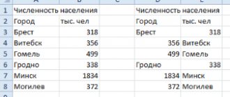
Creating a spreadsheet called: “Population, million”, visualizing the table using a pie chart.
Purpose of practical work:
- Learn to create a spreadsheet,
- Learn how to construct a pie chart to compare the populations of the seven most populous countries in the world.
Hardware and software:
A computer with the Windows or Linux operating system installed.
Progress of practical work:
- Open the Excel application (Windows OS) or Libre.Office.3.4.Calc (Linux OS). In the appendix, enter the data into the table as shown in the example (see “Practical work”).
- Select the resulting table and align the text in the table cells according to the application control panel), select the font size 14 Times New Roman.
- Select the first two cells (A1:B1) and select the font format – bold (the “Bold” icon on the application control panel).
- Using the mouse, stretch the width of the cells so that the entire text fits in them.
- Select the resulting table (A1:B8) and convert it into a circular table (via Insert – Diagram – Circular).
- Place the resulting diagram to the right of the table.
- Save the work on your desktop, indicating the student's full name and class.
(An example of practical work is attached).
- Summarizing. It is at the discretion of the teacher to assign grades for the lesson. Homework explanation. Entry in diaries (2-3 minutes)
- Learn new concepts in a notebook;
- Read the paragraph “Spreadsheets”
Questions from our readers
Below we will give answers to frequently asked questions from users who want to make a chart in Excel as convenient and beautiful as possible.
How to make a percentage chart?
To present the data in the figure not in absolute, but in fractional (percentage) values, you do not need to make changes to the table; quite simple:
- Right-click on the chart field and select “Data Label Format” from the context menu.
- Check the “Shares” checkbox and (optional) clear all other options.
Tip: the user can return to the original state by clicking on the “Reset” button in the same menu.
How to swap axes in a chart?
Due to the nature of Excel, the question is more complicated than it seems at first glance. The axes in the diagram are series and categories; The following example will consider two options for replacing data, simpler and more complex.
You can swap the chart axes as follows:
- Right-click on the image and click on the line in the “Select data” context menu.
- Click on the “Row/Column” button in the new window, several times if necessary.
- As a result, the ordinate axis in the diagram will change to the abscissa axis, and vice versa.
- The button of the same name and equally functional can be found on the “Design” tab of the Excel menu ribbon.
- If the method does not produce results, you should open the “Select Data” window again and click on the “Change” button in the “Horizontal Axis Labels” section.
- In the next window, by clicking on the upward arrow, select the row of data for the signature with the mouse, essentially replacing the Y values with X.
- Click on the “Edit” button in the “Legend Elements” section.
- And select, by dragging the mouse, a column to display on the chart - now the X values have changed to Y.
- As a result, the user will receive a new diagram that fully meets the new requirements.
- The same thing, following the sequence of actions, can be repeated with a histogram created from a diagram: the X axis turns into Y...
- …And vice versa.
Tip: to return the values to their place, you do not need to do the operations in reverse order - just press Ctrl + Z several times until Excel returns the chart to its previous form.