Fine art lesson notes for grades 7-8. Design of Architectural Environment
Summary of a fine arts lesson for grades 7-8 on the topic: “Design of the urban environment”
Master class: “From a planar image to a three-dimensional layout.”
Author: Tambovtseva Irina Nikolaevna, teacher of fine art and art. Place of work: State Budgetary Educational Institution Secondary School No. 868, Moscow Description of the material: Paper plastic is one of the main approaches to the study of the constructive arts of design and architecture in fine arts lessons in grades 7-8 according to the B.M. program. Nemensky. This master class will help the student move from planar images to volumetric layout. For the lesson, you can use not only colored, but also white paper, creating a monochromatic three-dimensional composition. If we slightly reduce the requirements for the design of architectural structures in work, then we can offer work to grades 5-6. Goal: To expand students’ knowledge about architecture, to teach how to design architectural structures from paper. Objectives: 1. Show the artistic specifics and features of the expressive means of architecture. To familiarize students with the properties of architectural volumes. 2. To develop figurative representation, logical thinking, and imagination of students when creating a composition from paper in volume. 2. Foster patriotic feelings and respect for historical monuments. Form: creative activity, master class Equipment: Multimedia installation, illustrations of architectural structures on the screen, colored or tinted paper, scissors, glue. Lesson progress: 1. Checking readiness for the master class (equipment and materials). 2. Announcement of the topic and goals. Teacher: They say that architecture is frozen music. Architecture is the art of constructing and decorating buildings. Name what types of architectural structures do you know? Students: Residential, industrial, religious, etc. Demonstration of modern architectural structures on the screen.
Teacher: We looked at different architectural buildings and saw that they are not similar to each other, but each is beautiful in its own way. Why do you think buildings have different shapes? Student: Architectural buildings consist of various geometric volumes: cubes, prisms, cylinders, cones, pyramids. Teacher: The language of architecture is the language of geometric volumes, spaces, rhythm; scale. Of course, we more often see a simple form of architectural form. But there are buildings that have a more complex composition. Most structures are distinguished by the fact that they are not one volume, but a combination of different volumes. What determines the difference in architectural forms? Student: The fact that architectural structures have different shapes depends on the purpose of the building, on its function. When creating an object, the architect looks for the most appropriate form of the building according to its function.
Teacher: Of course, beautiful buildings make people happy. We don’t pay attention to the same type of gray buildings, but if we see a building of an unusual shape, we look at it and study it. The expressiveness and unusualness of buildings can be achieved by complicating the relief of the walls. Using modules repeatedly, connecting them together in different ways, you can achieve an immeasurable wealth of forms. 3. Master class. Let's get down to practical work. You and I must construct a town from sheets of white or colored paper. Remember that this is a creative assignment and that your architectural designs must be original. To get started, choose the color of the sheet for the background and its size. Let's place it horizontally or vertically.
Initially, you need to cut out the surface of the earth from paper. Let's choose the color of the paper and cut out the uneven horizontal part, maybe several to complicate the surface. Place the pieces on the sheet, one after the other, and glue them to the bottom edge.
Let's start making architectural structures. Let us remember that buildings have different shapes and sizes depending on their purpose. Choose the appropriate color and size of paper for the building. Fold it in half to create window openings.
On the fold we cut out the shape of the window openings. The shape of window openings can be varied.
Having unfolded a sheet of paper, we get the slots for window openings.
We bend the sides of the resulting building by 2-3 mm for further gluing to the background blank.
We insert a strip of paper of a different color into the slots for illumination in the window.
We choose a place on the background blank for the building, not forgetting about the ratio of the scale of the building and the background. We glue the building by the edges, getting a small volume.
Using the same principle, choosing different colors and shapes (for example, a cylinder), create the design of the next building. Can be supplemented with various elements: roofs, pipes, awnings, canopies.
The following building can be constructed from several geometric shapes. Using modules repeatedly, connecting them together in different ways, you can achieve an immeasurable wealth of forms. The expressiveness and unusualness of buildings can be achieved by complicating the relief of the walls.
The result was a town with different architectural structures.
In any city, in addition to houses and various buildings (cafes, shops, banks, etc.), there are parks, squares, alleys. Let's add images of trees and bushes to our composition. To do this, select the color and size of the paper depending on the required scale of the tree. Fold the sheet in half for symmetrical cutting. From the bend we cut out the outline of the tree according to the shape.
Inside the part we cut out patterns of branches: drops, curls.
Having chosen the shades of paper, we cut out different tree shapes using the same principle.
We arrange the trees on the blank in accordance with the scale of the buildings. Having given them an additional shape, bending them a little, we glue them by the edges.
The composition can be supplemented with transport and small decorative details. Our composition is complete.
The result was a variety of compositions in terms of location, color scheme and shape of architectural structures.
Literature for preparation: 1. Gurov G.E., Piterskikh A.S. Design and architecture in human life. 7-8 grades 2. Fine arts and artistic work grades 1-9” Programs, Moscow, 2010 3. B.M. Nemensky “The concept of art education as the foundation of the system of aesthetic development of students at school.” Moscow, 1992
We recommend watching:
Summary of an integrated lesson in fine arts and music for students in grades 5-6. Summary of an art lesson in 5th grade. Decoration of a Russian hut Art lesson using “Technologies for the development of critical thinking through reading and writing (R Summary of an art lesson in 6th grade. The element of the sea in the works of artists
Similar articles:
Summary of an art lesson in 4th grade on the topic “All nations mourn the fallen fighters and sing their praises”
Lesson notes on fine arts, 8th grade. Design and architecture in human life
Lesson on fine arts on the topic “Color in architecture and design” (8th grade)
Fine arts lesson according to B. Nemensky’s program “Color in architecture and design.” 8th grade
Target
: determine the role of color in architecture and design.
Tasks:
- Review knowledge about color;
- Develop skills in rational combination of colors in things;
- Formation of the ability to determine the unity of style, color, shape, texture in accordance with the thing. The Modern Institute of Style and Design can help you with this: https://kubshm.ru .
- Fostering mutual assistance and the ability to work in pairs;
- Choosing colors in accordance with the mood and psychological and emotional state of students.
Equipment
e: packaging items, scissors, ruler, pencil, compass, colored cardboard, paper, braid, beads, glue, brush, accompanying presentation.
Org. moment
.
Repetition of previously learned
: The role of color in the constructive arts.
It is color that makes houses and things more expressive. The role of color in design and architecture is based on the laws of color combinations and the rules of color science.
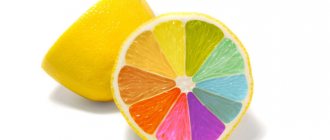
Working according to the “Color Wheel” scheme
- Remember and name the primary colors (
red, yellow, blue)
- the basis of a person’s ability to perceive and distinguish colors and shades.
All other colors are based on mixing primary colors.
- Primary colors
- red, yellow, blue;
- Composite colors
- orange, purple, green;
- Additional colors
- diametrically opposed (red-green), contrasting, but harmoniously combined.
Patterns of color harmony:
- Color contrast (opposite colors of the vertices of the triangles)
- Color nuance (adjacent colors in a circle)
- Harmony of brighter and less bright shades of the same color.
- Combination of color or its shade (chromatic with achromatic: black or white)
Learning new material
.
Trees, grass, sky have a color from nature, and the color of a building or thing is created by an artist. The psychological effects of color must be taken into account in design and architecture. Color affects the perception of the volume of a room and has an emotional and psychological effect.
- Red - warmth, conflict Blue - calming, reduces blood pressure Blue, purple - calming, depressed mood Yellow - good mood, fun, stimulates mental activity and vision Orange - improves appetite, mild agitation, increases blood circulation
- Green - calms, gives rest to the mind, awakens patience, optimal color The color highlights the dominant, i.e. The main thing. Buildings can be connected or separated using color
- Color coating texture:
- Mirror
- Matte
- Mixed
The way color is used in design and architecture is different than in painting. If in painting there are many different shades and nuances, then in design and architecture color is applied locally (uniformly). Color in architecture is not as open and intense as in painting things (usually pastel, whitewashed).
Analysis of the use of color in architectural buildings
.
In the old days, the color of a building was determined by the material from which it was made. In Russian architecture it is the color of wood. Over time, the wood darkened and lost its shades. Therefore, they tried to make the inside of the building bright and joyful, using paintings, embroidery, painted utensils, and in stone construction - stained glass windows, interior painting, decoration (Amber Room, Golden Chamber). In design, as in architecture, color enhances our perception of form and sharpens our attention.
Focus on practical work
.
Packaging is an advertisement for an item, so its style is consistent with the style of the item included in it. The packaging can be of any shape: it can be just a bag, a package, or a decorated box. In addition to the advertising function, the packaging has a protective function, making it convenient to carry things. The packaging design should be distinguished by a unified style of color and shape, texture and font, and most importantly, correspondence to the contents.
So, in front of you are various things (students are offered items to choose from: telephone, eau de toilette, souvenir toy, book, etc.)
Practical work
.
— Your task is to pack the item for a gift. For packaging, a sketch is initially developed in accordance with the item being packaged, then a development is drawn.
Compliance with safety rules when working with tools.
Work in pairs.
Lesson summary
.
— Justify the choice of shape, combination of color and design with the contents of the package (protection of your work).
Evaluation of student work.
D/Z
: reports on the topic “Architectural styles in the history of art” (in groups: 1 - architecture of the Middle Ages, 2 - architecture of the 19th-21st centuries)